
What you'll learn
- 12 color combinations tested on the same drawing, with HEX codes you can copy
- The rules that make colors go together, drawn from those 12 tests
- The best two-color combinations, and how to balance three or four colors
- A chart of 21 colors: what goes with navy blue, red, burgundy, olive green and more
- Colors that go with everything, and colors that don't go together
- How to use a combination in an outfit, a room or a coloring page
- Colors that go together: the short answer
- 12 color combinations, tested on the same drawing
- What these 12 colorings taught us
- The best two-color combinations
- Three or four colors that go well together: how to balance them
- What colors go with…? A color-by-color chart
- Colors that go with everything
- Colors that don’t go together, and how to fix them
- Outfits, rooms, coloring pages: adapting a combination
- Try it yourself: the printable armchair
- Key takeaways
A mustard armchair in front of a navy blue bookcase: the picture works instantly. The same armchair in bright red against a neon green bookcase, and your eye has nowhere to rest. Not a single line of the drawing changed between the two. Only the colors did.
That is the experiment we ran to answer a question everyone asks sooner or later, in front of a closet, a paint chart or a box of colored pencils: what colors go together? We took one drawing, the reading armchair from our cozy coloring pages, and had it colored 12 times with 12 different color combinations. Then a 13th time, with a combination that fails on purpose, to see exactly what goes wrong.
Below you will find all 12 combinations with their HEX codes, what the tests taught us, the best two-color pairs, a color-by-color chart, and tips for outfits, rooms and coloring pages.
Colors that go together: the short answer
Colors go together when they are not fighting for attention. In practice, three conditions are enough:
- one color leads: it covers the largest area, the others support it;
- there is light and dark: two colors of the same lightness blur together, however pretty each one is;
- only one color is bright: the others are softer, deeper or neutral.
Here are the 12 combinations from our test at a glance. Click or tap a color to copy its code.
-
1. Navy blue, mustard yellow and cream
-
2. Burgundy, blush pink and antique gold
-
3. Sage green, terracotta and cream
-
4. Forest green, cherry red and cream
-
5. Olive green, rust and sand
-
6. Light blue, camel and off-white
-
7. Off-white, black and gold
-
8. Light gray, sunny yellow and charcoal gray
-
9. Teal, orange and cream
-
10. Lavender, butter yellow and white
-
11. Turquoise, coral and sand
-
12. Beige, chocolate brown and ivory
12 color combinations, tested on the same drawing
To keep the comparison fair, each color always plays the same role. The bookcase, the largest area, gets the first color. The armchair, the main element, gets the second. The throw, pouf, lampshade and mug get the third, as small accents. The plants, the basket and the floor stay the same in all 12 pictures, so only the combination changes.
The 12 versions were colored by an AI tool from our drawing, using the exact color codes we gave it. Under each picture, click or tap a color to copy its code, or open all three colors in our gradient generator.
Navy blue, mustard and cream
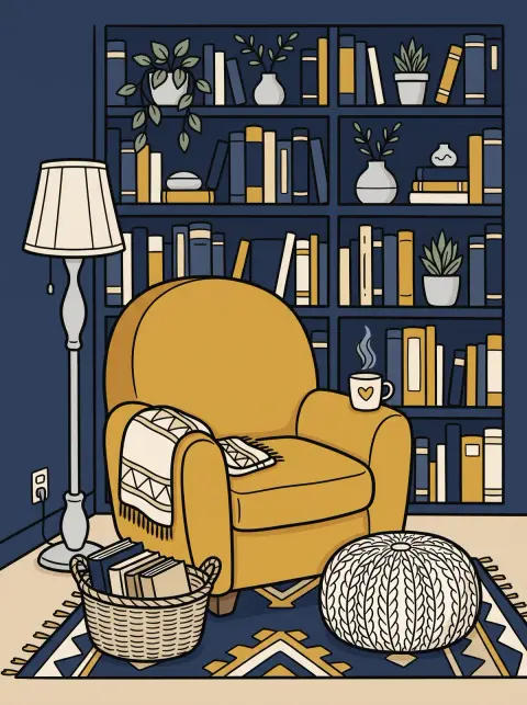
The safest combination in our test, and probably the most versatile. Navy blue acts like a softened black: deep, elegant, never harsh. Mustard answers with warmth, and cream brings the light. One cool color, one warm color, one light color: everything is there.
It works just as well in a living room (navy walls, a mustard armchair) as in an outfit (a mustard sweater, navy pants, cream sneakers). When coloring, keep the navy for large backgrounds and put the mustard on your main subject: it will stand out on its own.
Burgundy, blush pink and antique gold
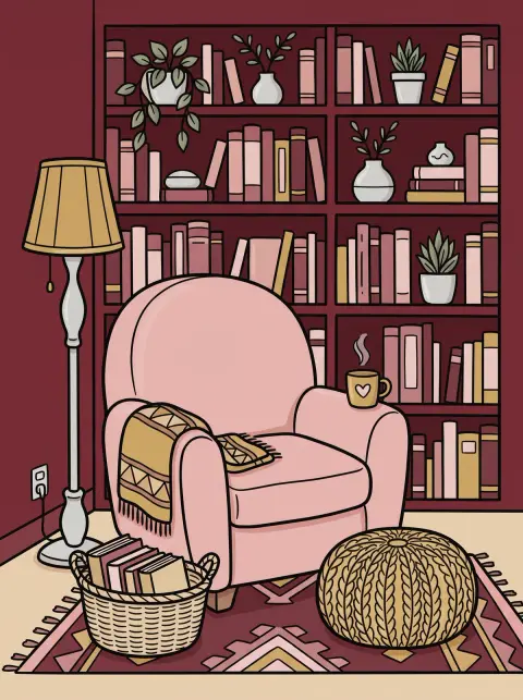
A range of reds, from the deepest to the palest, lifted by a touch of gold. Burgundy gives depth, blush pink softens it, antique gold adds shine. The result is warm and refined, perfect for fall and the holidays.
It is a favorite in interior design (burgundy velvet, pink cushions, brass) and a safe choice for a dressy outfit. The secret: keep the pink very light, almost beige, or it starts competing with the burgundy.
Sage green, terracotta and cream
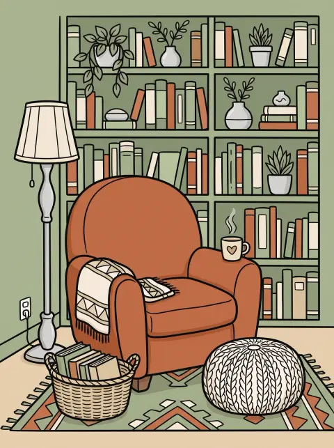
The decor combination of the last few years, and it is easy to see why. Sage green, soft and slightly grayish, and terracotta, warm like a clay tile, sit almost opposite each other on the color wheel, but both are toned down. You get contrast without any harshness.
It brings to mind plants, clay and linen. Try it on flower coloring pages or landscape coloring pages, where it always looks natural.
Forest green, cherry red and cream
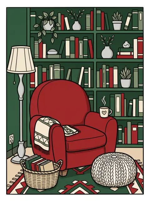
Red and green: the pair people are wary of, because it can turn garish fast. Here it works, and that is the whole point of the test: the green is very dark, almost black, and the red covers a single area. Cream gives everything room to breathe.
It is the Christmas combination by definition, ideal for Christmas coloring pages, and also the palette of English-style interiors with green paneling and red fabrics. Keep it in mind: we compare it with the failed example further down.
Olive green, rust and sand
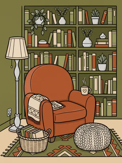
Three earth tones, like a fall landscape in the south of France. Olive green and rust share the same slightly muted softness, and sand ties them together. This family of colors, often called earth tones, is just as popular in home decor as in fashion.
Olive green is also the khaki of a field jacket: add a rust sweater and sand pants and the outfit is done. On a coloring page, this palette suits anything made of leaves, wood or leather.
Light blue, camel and off-white
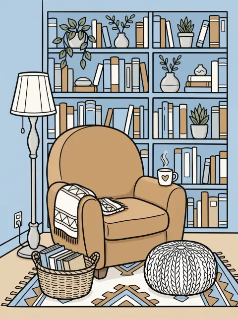
The freshest combination in the test. Light blue is cool and bright, camel is warm and soft: they balance each other perfectly, and off-white keeps the whole picture light. No color takes over, which gives a clean, polished look.
Think of a light blue shirt with a camel coat, or a bright bedroom with wooden furniture. On a drawing, it feels like a spring morning.
Off-white, black and gold
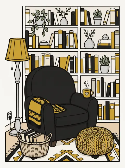
The most elegant, and the simplest. Black and white give the strongest possible contrast, and gold adds the only touch of color. Notice that white sits on the largest area: with a black bookcase, the drawing would have felt heavy.
Black and gold is a classic for invitations, greeting cards and party decor. To color it, a black marker for the dark areas and a gold or ochre pencil for the details are all you need.
Light gray, sunny yellow and charcoal gray
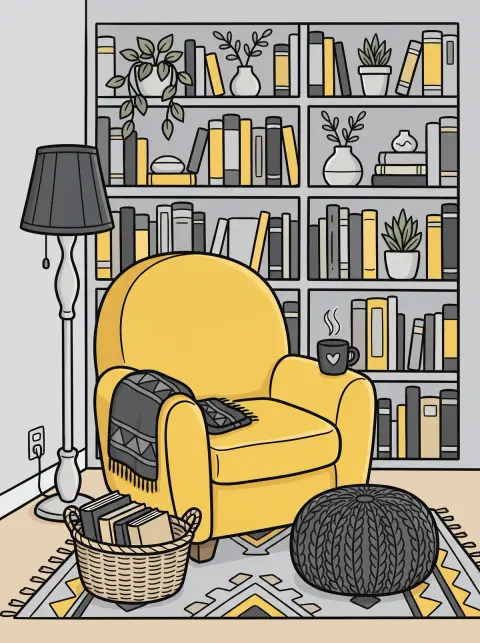
Gray is the best friend of bright colors: being neutral, it lets them shine. With two grays, one light and one dark, yellow becomes the star without overpowering the rest. It is the “only one bright color” rule taken all the way.
This combination works beautifully in a kitchen or an entryway, and in an outfit: a yellow sweater under a gray coat. On a drawing, put the yellow on a single element and let the grays do the rest.
Teal, orange and cream
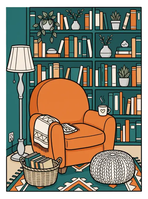
Blue and orange face each other on the color wheel: they are complementary colors, and each makes the other look brighter. Choosing a deep teal instead of a bright blue keeps the glow without the garish effect.
It is the liveliest combination in the test, ideal for a coloring page that needs to pop, a poster or a notebook cover. Cream leaves a little air between the two.
Lavender, butter yellow and white
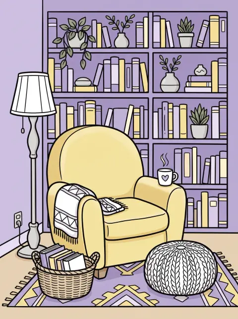
Two pastels from opposite sides of the wheel: purple and yellow are complementary too, but lightened so much that the result stays gentle. White keeps it airy. It is the palette of stationery, invitations and bright bedrooms.
The trap with pastels is a lack of contrast. On a coloring page, go over the outlines again or add a slightly deeper shadow, or the drawing will look washed out.
Turquoise, coral and sand
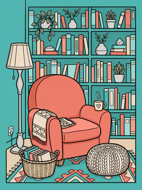
A vacation combination: water, coral, beach. Turquoise and coral are almost complementary, and both are bright, which makes the whole picture cheerful. Sand softens them.
Coral is having a moment: searches for what goes with it nearly doubled in a year. It goes with every watery blue, from turquoise to navy. Perfect for a seaside drawing or a summer-colored mandala.
Beige, chocolate brown and ivory
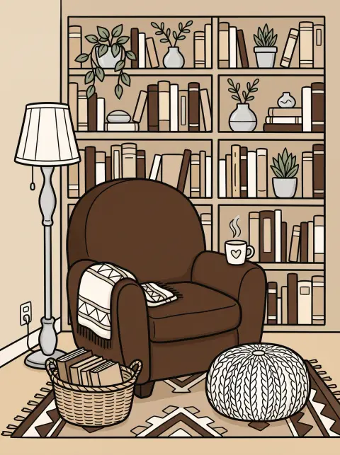
Not a single bright color, and the picture still works: this is a monochromatic scheme, one family of colors running from light to dark. Chocolate brown brings depth, beige and ivory bring light. The result is understated, warm and elegant.
It proves you do not need many colors. These warm neutrals also make the best base for an outfit or a room: you add a single color on top, depending on your mood.
What these 12 colorings taught us
Looking at the 12 pictures side by side, the same four lessons come back every time.
- The largest area sets the mood. The bookcase covers almost half of the drawing: it decides whether the picture feels dark or light, warm or cool. The most successful combinations put a deep color there (navy blue, forest green, burgundy) or a very light one (off-white, light gray, lavender), never the brightest color.
- Always a light and a dark. In each of the 12 pictures, at least one color is clearly lighter than the others. Without that gap, even two beautiful colors blur together. Painters call it value, and value, more than hue, is what makes a drawing readable.
- Only one bright color. Mustard, cherry red, orange, sunny yellow, coral: each time, a single color catches the eye and the other two support it.
- One warm and one cool is even better. Navy and mustard, teal and orange, light blue and camel: pairing a warm color with a cool one creates a natural balance. All-warm combinations (burgundy, pink, gold) and all-neutral ones (beige, chocolate, ivory) work too, as long as you play on light and dark.
For the theory behind these lessons, our color wheel guide explains color harmonies (complementary, analogous, triadic…) and the 60-30-10 rule.
The best two-color combinations
Two colors is the simplest option, and often what you need for an outfit, a card or a logo. The principle does not change: one dark or deep color, one light or warm color. Here are ten two-color combinations that work almost every time.
-
Navy blue and camel
-
Sage green and blush pink
-
Burgundy and beige
-
Black and gold
-
Terracotta and teal
-
Gray and mustard yellow
-
Forest green and cream
-
Light blue and butter yellow
-
Lavender and sage green
-
Cherry red and pink
Navy blue and camel is probably the easiest pair to wear. Black and gold is the dressiest. Red and pink, long seen as a clash, has become a fashion classic: it works as soon as one of the two is clearly lighter. And lavender with sage green shows that two soft colors get along very well, as long as they are not exactly the same lightness.
Three or four colors that go well together: how to balance them
With three colors, it all comes down to proportions. On our armchair, the split was always the same: the bookcase, about 60% of the drawing; the armchair, about 30%; the throw, pouf, lampshade and mug, the remaining 10%. That is the 60-30-10 rule, covered in detail in our color wheel guide.
To choose your three colors:
- start from the color you love, then find its partners in the chart below;
- add a neutral (cream, off-white, sand, gray): it is what gives the whole combination room to breathe;
- put the brightest color on the smallest area, never on the background.
For a four-color combination, keep the same base and add a second accent in a very small amount. Three examples:
-
Navy blue, cream, mustard yellow and terracotta
-
Cream, sage green, terracotta and chocolate brown
-
White, lavender, butter yellow and sage green
Beyond four colors, the eye struggles to follow: play with shades of a single color instead, from light to dark. Each color has its own page in our color shades, and if you would rather start from a set that is already put together, our color palettes by theme offer sets for fall, Halloween, Christmas and pastels.
What colors go with…? A color-by-color chart
You are starting from one specific color: a sofa, a dress, a wall, your favorite pencil. The chart gives you, for 21 colors, the ones that go with it, a tip, and a link to the page that shows more.
| Color | Goes with | The tip |
|---|---|---|
| Navy blue |
| It replaces black anywhere, only softer: a warm touch (mustard, camel) makes it shine. Blue pairings and gradients |
| Red |
| Keep it for one area, surrounded by colors that are quieter or darker than it is. All shades of red |
| Burgundy |
| A deep red that loves warm, light tones: beige, antique gold, blush pink. All shades of red |
| Pink |
| Next to gray or sage green, pink looks elegant rather than sugary. Pink pairings and gradients |
| Orange |
| Its best partner is a deep blue, teal or navy: a strong contrast that never looks garish. All shades of orange |
| Yellow |
| On charcoal gray or navy, it pops without overpowering the rest. All shades of yellow |
| Green |
| Earth tones (terracotta, cream) and blush pink make it look natural and warm. Green pairings and gradients |
| Sage green |
| The easiest green to pair: it gets along with every soft, warm tone. Sage green pairings and gradients |
| Olive green and khaki |
| An earthy green: it loves rust, sand and cream, and navy for a sharper look. All shades of green |
| Blue |
| Bright blue calls for a warm touch: a little orange or gold is enough to wake it up. Blue pairings and gradients |
| Light blue |
| With camel or off-white it looks fresh and polished; with butter yellow it looks like spring. Blue pairings and gradients |
| Turquoise |
| Coral and sand for a holiday feel, navy for a more classic look. Teal pairings and gradients |
| Purple |
| Gold makes it rich, gray and sage green make it softer. Purple pairings and gradients |
| Lavender |
| A pastel that goes with other pastels, and with light gray to soften it even more. Purple pairings and gradients |
| Brown |
| A warm neutral: cream lightens it, sage green and teal make it look modern. Brown pairings and gradients |
| Beige |
| It goes with everything, but it needs a darker color next to it so it never looks dull. All shades of beige |
| Gray |
| Gray shows off whatever color you give it: pick just one, and make it clear. Gray pairings and gradients |
| Black |
| Black gives strength to every color; a touch of gold or red is all it needs. All shades of black |
| White |
| It lets the other colors breathe: the best background for a strong color. All shades of white |
| Terracotta |
| With sage green and cream it is the decor pairing of the moment; with teal it turns bolder. All shades of orange |
| Coral |
| A pinkish orange that loves watery blues: turquoise, or navy for a smarter look. Teal pairings and gradients |
What colors go with navy blue?
Almost everything, which makes navy as practical as black. The best matches: mustard, camel, off-white, blush pink, red, and sage green for a softer look. In an outfit it replaces black with a gentler touch; on a wall it makes light wood and brass stand out. Does navy go with black? Yes, as long as the two are clearly different, for example navy pants with black boots and a light top.
What colors go with red?
Red gets along with colors that are darker or more neutral than it is: navy blue, forest green, charcoal gray, cream, white. For an outfit, a red top with jeans or navy pants is a classic; red and pink, bolder, is very much in fashion. In a room, keep red for one piece, an armchair, a lamp, a rug, rather than a whole wall.
What colors go with burgundy?
Burgundy loves warm, light tones: beige, cream, blush pink and antique gold. For contrast, pair it with sage green or navy blue. It is a rich color, so let it cover a medium area and surround it with light neutrals, as in our burgundy, blush pink and antique gold combination.
What colors go with orange?
Its best partner is a deep blue, teal or navy: the contrast is strong but never garish. Orange also works with cream, chocolate brown and olive green for a warmer, earthier look. Burnt orange, the darker version, is easier to use in large amounts than bright orange.
What colors go with yellow?
It depends on the yellow. Bright yellow needs solid support: charcoal gray, navy blue, white. Mustard, softer, goes with navy, gray, forest green and burgundy. Pale butter yellow pairs with lavender, light blue and sage green. In every case, a little yellow works better than a large flat area.
What colors go with olive green?
Olive green is an earthy green, so it is easy to match: beige, sand, cream, rust, camel, brown and navy blue all suit it. For a livelier outfit, add a touch of brick red or mustard. Just avoid placing it next to a green from another family, like bright apple green: two unrelated greens clash.
What colors go with light blue?
Light blue looks fresh and polished with camel, off-white and gray, and springlike with butter yellow. For more contrast, add navy blue: two blues, one light and one deep, always work together. It is one of the easiest colors to wear near the face, which explains its place in so many wardrobes.
What colors go with black?
Black goes with every color, which is why it anchors so many wardrobes. The most striking pairs: black and white, black and gold, black and red, black and camel. On a drawing, black is often too strong for a large area: keep it for outlines, shadows or a single element, like the armchair in our off-white, black and gold combination.
Colors that go with everything
Some colors have little or no hue, so they never clash with anything: these are the neutrals.
- white and off-white let everything breathe and brighten the colors next to them;
- cream, ivory, sand and beige are warmed-up whites, softer than pure white;
- gray shows off a bright color, as long as you pick just one;
- black adds strength, in small amounts;
- navy blue and camel behave almost like neutrals: people wear them every day with any color, from jeans to coats.
When a combination is not working, adding a neutral is often the simplest fix: it separates the colors that compete and lets the drawing breathe.
Colors that don’t go together, and how to fix them
Here is our 13th test, failed on purpose: neon green, bright red and electric purple, all three at full strength.
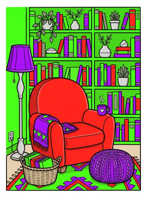
Do not copy this one
- Bookcase neon green #39FF14
- Armchair bright red #FF1E1E
- Accents electric purple #9D00FF
The problem is not the colors themselves, but three mistakes made at once:
- three bright colors at the same time: none of them leads, all of them demand attention;
- the same strength everywhere: no light, no dark, so no depth;
- the loudest color on the largest area: the neon green takes over the whole drawing.
Compare it with the forest green, cherry red and cream combination: red and green are there too, facing each other on the color wheel. But the green has turned very dark, the red covers only the armchair, and cream makes the transition. Same color families, opposite result.
To rescue a combination that clashes, three moves are enough: darken one color (neon green becomes forest green), soften another (electric purple becomes lavender) and shrink the third to a few accents. A neutral, white, cream or gray, finishes the job.
Outfits, rooms, coloring pages: adapting a combination
Colors that go together in an outfit
The same rules apply, with one advantage: most wardrobe basics are already neutral. Start from a base (denim, navy, beige, gray, black or white), add a single strong color, and repeat it once with a bag, a scarf or shoes. Near your face, choose the colors that flatter you, and keep the others for the bottom half of the outfit.
Colors that go together in a room
In a room, the largest areas are the walls and the floor, exactly like the bookcase in our drawing. Give them the softest or the deepest color, keep the second for large furniture (sofa, curtains, rug) and the third for objects (cushions, vases, lamps). Before painting a wall, test the combination on a sample in daylight: a color changes a lot between morning and evening.
Colors that go together on a coloring page
On a coloring page, choose your colors before you start, and test them in a corner of the sheet or on scrap paper. Color the largest area first, then the subject, then the accents: it is easier to judge a bright color once the background is in place. Think about light and shadow too: two shades per color, one light and one dark, are enough to add volume. To mix them with your pencils or paints, our color mixing guide has the recipes.
Try it yourself: the printable armchair
The drawing in this article is one of our cozy coloring pages. Print it a few times and test your own combinations: it is the best way to find the ones you love, with your own pencils, whose colors never look exactly like a screen.
Download the reading armchair coloring page
The drawing behind our 12 combinations, in black and white, ready to print so you can try your own.
To try a combination on screen first, every card in this article opens its three colors in our gradient generator, where you can adjust them, save them as an image or print them.
FAQ — Colors that go together
7What colors go well together?
What are 5 good color combinations?
What is the best 3 color combination?
What two colors look really good together?
What color goes with everything?
Which two colors should not be worn together?
What colors make a room look expensive?
Key takeaways
- One color leads, the others support it: the largest area sets the mood.
- Always a light and a dark: the gap in lightness is what makes a combination readable.
- Only one bright color, on the smallest area.
- Neutrals go with everything: off-white, cream, beige, gray, black, and nearly navy blue.
- A clashing combination can be fixed: darken, soften, shrink.
To go further, our color wheel guide shows where these combinations sit on the wheel, and our color mixing guide gives the recipes to get them with your pencils or paints. Looking for more ideas? Browse our color palettes, find the right shade in our color shades or build your own combination in the gradient generator. Our digital art tools page brings them all together.
Ready to try your own combinations? The snug interiors in our cozy coloring pages are made for it
See the cozy coloring pages