What you'll learn
- An interactive color wheel: pick a color and see its complement, its neighbors and its triad
- Primary, secondary and tertiary colors, and why there are three different color wheels
- A complementary colors chart for 24 colors, including brown, beige and burgundy
- Warm and cool colors, and how to use them to add depth
- Six color harmonies shown on the same drawing
- A printable blank color wheel to color in yourself
- The interactive color wheel: pick a color
- What is a color wheel?
- Primary, secondary and tertiary colors
- Which color wheel is right? Paint, screen and print
- Complementary colors: the opposite on the color wheel
- Warm and cool colors
- Color harmonies, shown on a real drawing
- How to use a color wheel for coloring, in 4 steps
- Common questions: clashing colors, black and white
- Printable blank color wheel and harmonies sheet
- Key takeaways
Put a tangerine in a blue bowl and it looks more orange than ever. Put it in a yellow bowl and it blends into the background. That’s not magic: it’s the color wheel at work, the circle of colors where each one has its neighbors and its opposite.
If you color, paint or draw, the color wheel is the most useful tool there is. It answers the questions you ask yourself in front of a box of pencils: what goes next to this color? Why does this page look flat? How do I make one detail pop? This guide explains color theory without the jargon, starting from what you want to see on your page.
Inside: an interactive color wheel to play with right away, primary, secondary and tertiary colors, the complementary colors of 24 colors, warm and cool colors, six color harmonies shown on the same drawing, and a printable blank color wheel.
The interactive color wheel: pick a color
Tap a color on the wheel, then choose a harmony. The wheel marks the colors that go with it, gives you their codes and colors a little bouquet so you can see the effect on a real drawing straight away.
Find your colors on the wheel
Tap a color on the wheel, then pick a harmony: its colors appear with their codes, and the bouquet is colored with them.
Two colors facing each other: the strongest contrast, best used with one color clearly in the lead.
The colors of this harmony
- Blue
#1E88E5 - Orange
#FB8C00
Everything is worked out on your device; nothing is sent anywhere. Treat the colors as a guide: your pencils and paints each have their own personality.
There are two wheels to choose from. The first is the painter’s color wheel, for colored pencils, markers, watercolor and paint: that’s the one to follow when you color on paper. The second is the screen wheel, handy for online coloring or a drawing app. We’ll see below why they don’t give the same results. And if your color isn’t on the wheel, the “Your color” swatch finds where it belongs and works out its harmonies.
What is a color wheel?
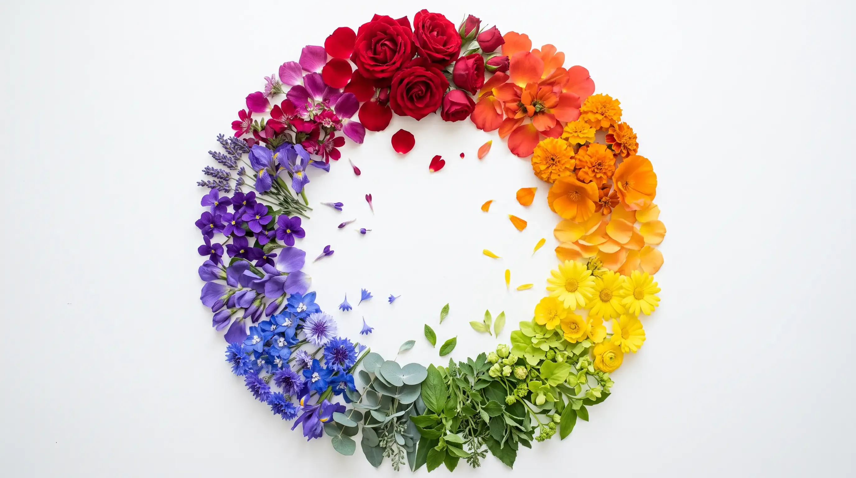
A color wheel is a circle with the colors arranged in rainbow order, each one sitting between its two neighbors: yellow touches orange, which touches red, which touches violet, and so on all the way to green, which meets yellow again. The word “chromatic,” which you’ll also see, comes from the Greek khrôma, meaning color.
The whole point of it fits in one idea. Two colors close together on the wheel look alike and blend gently; two colors facing each other are opposites and make each other glow. Everything else, color harmonies included, follows from that rule.
The idea goes back to Isaac Newton. In 1704, in his book Opticks, he noticed that the colors of the rainbow form one continuous band, and he joined its two ends: red meets violet, and the band becomes a circle. Painters later adapted it to their pigments, and their version is the one most of us learn at school.
How many colors are in the color wheel?
As many as you like, since colors flow into one another without a break. In practice, the wheel is split into segments:
- 6 colors for the simplest version: yellow, orange, red, violet, blue, green;
- 12 colors for the most common wheel, the one in the tool above and on our printable sheet;
- 24 colors or more for artists’ charts.
The 12-color wheel is all you need for everything below. Going clockwise from the top, its 12 colors are: yellow, yellow-orange, orange, red-orange, red, red-violet, violet, blue-violet, blue, blue-green, green and yellow-green.
Primary, secondary and tertiary colors
Those twelve colors don’t all play the same part. They fall into three families, which tell you how each one is made.
The primary colors are yellow, red and blue. They’re the base colors: you can’t make them by mixing anything else, and together they can make almost every other color. On the wheel, they form a perfect triangle, four segments apart.
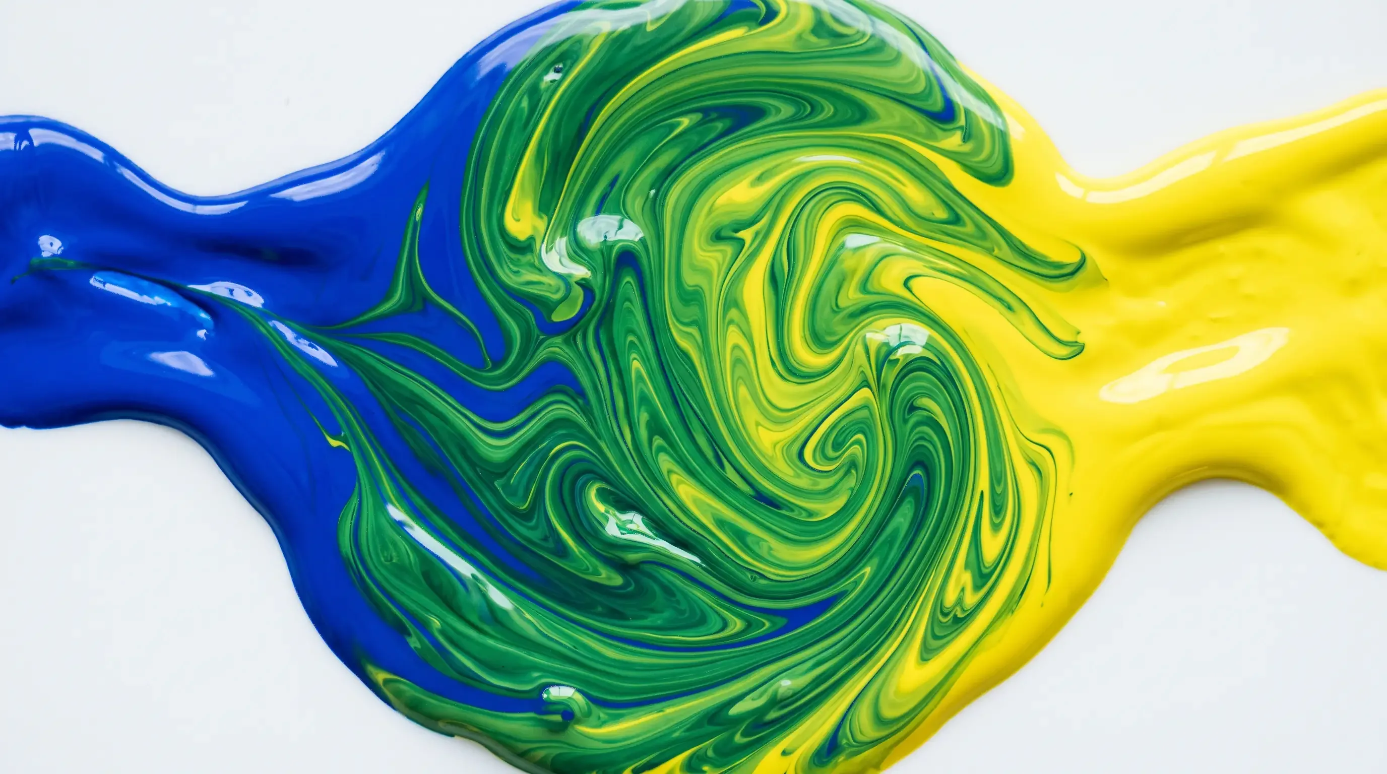
The secondary colors are orange, violet and green. Each one is a mix of two primaries: yellow and red for orange, red and blue for violet, blue and yellow for green. On the wheel, each sits exactly between its two “parents.”
The tertiary colors are the other six: yellow-orange, red-orange, red-violet, blue-violet, blue-green and yellow-green. Each mixes a primary with the secondary next to it, hence the two-part names, with the primary always first.
A few questions come up again and again, so here are straight answers:
- Are there three or four primary colors? Three. The number four comes from printing, which adds black to its three base inks for sharper text and cheaper printing; that doesn’t make black a primary color.
- Are black and white primary colors? No, and they’re not even on the wheel: they have no hue. They lighten or darken a color, which makes them very useful, but they aren’t colors of the wheel.
- What is a quaternary color? A term you’ll sometimes meet for mixes of two secondary or two tertiary colors. They’re muted colors, like olive or slate, and they aren’t part of the 12-color wheel.
To mix these colors yourself with your own pencils or paints, in the right proportions, everything is explained in our color mixing guide.
Which color wheel is right? Paint, screen and print
If you’ve ever compared color wheels online, you’ve probably noticed they don’t all match. Nobody got it wrong: there are three of them, because there are three ways to mix color.
-
Paint and pencils
Primaries: red, yellow, blue
Red ↔ green
-
Screens (light)
Primaries: red, green, blue
Red ↔ cyan
-
Printing (inks)
Primaries: cyan, magenta, yellow
Yellow ↔ blue
- The painter’s wheel, also called the RYB color wheel (red, yellow, blue), describes what happens with materials: paint, marker ink, pencil lead. Each color absorbs part of the light, so mixing them makes things darker. It’s the wheel used in art class.
- The RGB color wheel (red, green, blue) describes light. A screen lights up tiny red, green and blue dots; adding them together makes things brighter, all the way to white.
- The printer’s wheel (cyan, magenta, yellow) describes the transparent inks of a printer. Its base colors are purer than the painter’s red and blue, which lets it print cleaner colors.
The practical consequence is simple: the complementary color depends on the wheel. For a painter, the opposite of red is green; on a screen, it’s cyan. When you color on paper, follow the painter’s wheel. When you color on a screen or pick colors in an app, switch the tool to the screen wheel.
For science students, who meet the color wheel through the wavelengths of light, it’s the light wheel that matters: two complementary lights added together make white. That’s additive color mixing. With paint, it’s the other way around: two complementary colors mixed together make a dark gray or a brown. That’s subtractive color mixing.
Complementary colors: the opposite on the color wheel
Two colors are complementary when they sit directly opposite each other on the color wheel. The three basic pairs match each primary with the secondary it doesn’t contain:
- red and green;
- blue and orange;
- yellow and violet.
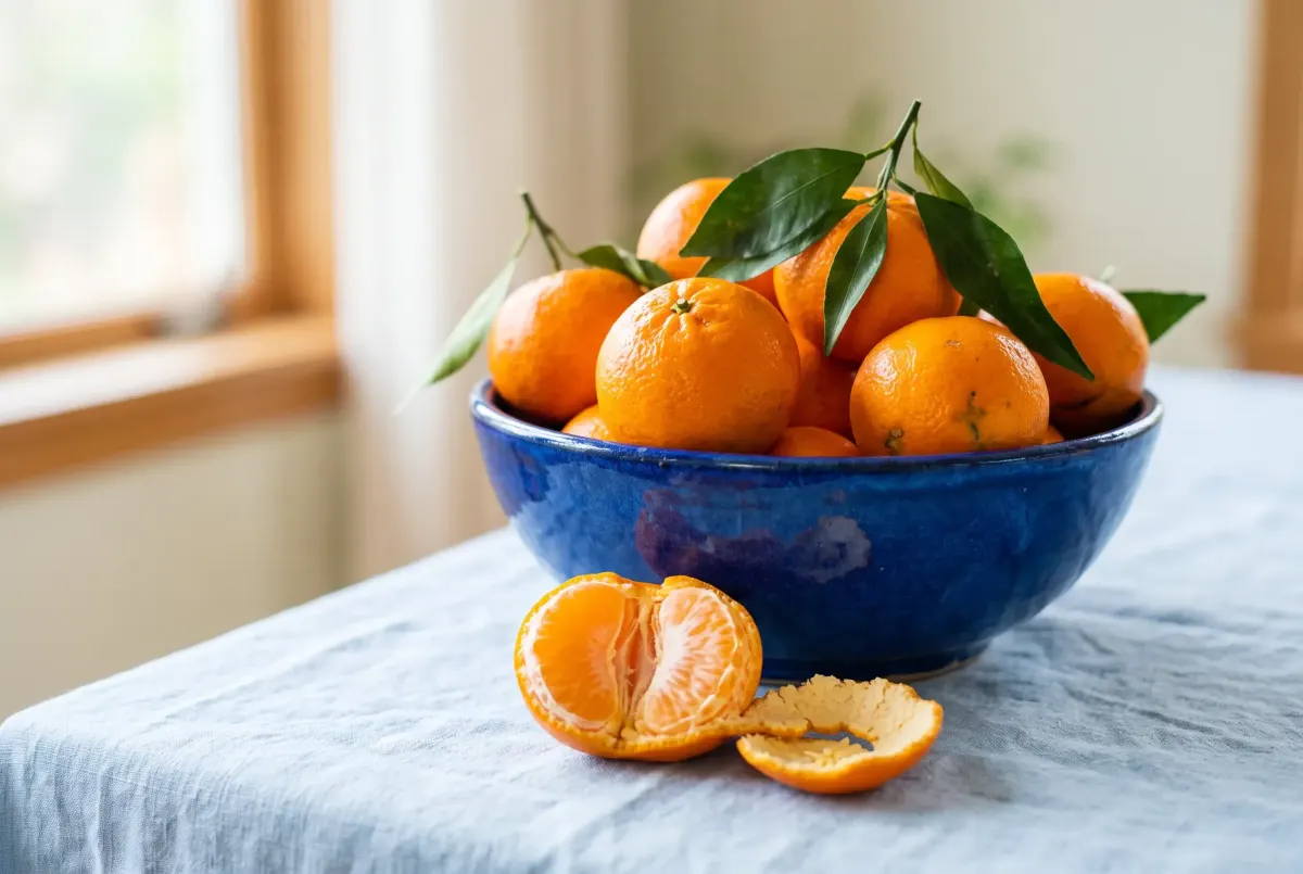
Complementary colors have two sides to them, and that’s what makes them so useful. Side by side, they make each other glow: faced with two opposite colors, the eye sees each one as brighter than it really is. Mixed together, they cancel out: between them, they contain all three primaries and turn brown or gray (the idea behind the “mixing compass” in our color mixing guide).
For coloring, that gives you one simple rule: a small touch of the complementary color makes a detail stand out. A red ladybug on a green leaf, an orange boat on a blue lake, the yellow heart of a violet flower. The secret is the dose: one color clearly leads, the other just adds a spark. Two bright complements in equal areas fight for attention, and the page becomes tiring to look at.
Complementary colors chart
Here’s the complementary color of 24 colors, with their codes and an idea for using each pair. First the 12 colors of the wheel, then 12 everyday colors that aren’t on the wheel but get searched for all the time. The “Show on the wheel” button loads the color into the tool so you can try its other harmonies.
| Color | Complement | How to use it |
|---|---|---|
Yellow #FDD835 | Violet #7B1FA2 | A violet dusk sky makes a yellow window glow. All shades of yellow |
Yellow-orange #FBB02D | Blue-violet #512DA8 | The pairing of lavender fields under a golden sun. All shades of yellow |
Orange #FB8C00 | Blue #1E88E5 | An orange boat on a blue sea: the brightest contrast of all. All shades of orange |
Red-orange #F4511E | Blue-green #00897B | Coral fish in turquoise water. All shades of orange |
Red #E53935 | Green #43A047 | A ladybug on a leaf: a small touch of red is enough. All shades of red |
Red-violet #C2185B | Yellow-green #9CCC65 | Fuchsia flowers against fresh spring leaves. All shades of pink |
Violet #7B1FA2 | Yellow #FDD835 | The yellow heart of a violet: exactly what nature does. All shades of purple |
Blue-violet #512DA8 | Yellow-orange #FBB02D | Golden stars on a night sky. All shades of purple |
Blue #1E88E5 | Orange #FB8C00 | Orange roof tiles under a blue sky. All shades of blue |
Blue-green #00897B | Red-orange #F4511E | Teal brought to life by a few coral accents. All shades of teal |
Green #43A047 | Red #E53935 | Red cherries in a tree: they jump out at you. All shades of green |
Yellow-green #9CCC65 | Red-violet #C2185B | Lime and plum: an unexpected, very stylish match. All shades of green |
| Color | Complement | How to use it |
|---|---|---|
Brown #7B4A2A | Petrol blue #1A607C | A tree trunk by a lake: the blue makes the wood stand out. All shades of brown |
Beige #C8A97E | Lavender blue #ADA8D8 | Two soft colors: contrast without glare, perfect for an interior scene. All shades of beige |
Pink #E75480 | Meadow green #6CA300 | Pink peonies among bright green leaves: nature does the same. All shades of pink |
Burgundy #800020 | Pine green #195000 | The classic Christmas pairing, in its deep version. All shades of red |
Navy blue #1F2A55 | Dark brown #442600 | Navy and leather: a classic for clothes and old sailing boats. All shades of blue |
Turquoise #30D5C8 | Coral #FF9D7F | The colors of a tropical reef. All shades of teal |
Teal #008080 | Terracotta #9D5C44 | A warm, rich pairing for mandala patterns. All shades of teal |
Khaki #8A7F4F | Dusty mauve #8E739B | Two muted colors: a natural, travel-sketchbook look. All shades of green |
Olive green #808000 | Plum mauve #A75B98 | Olives and figs: a ready-made still life. All shades of green |
Coral #FF7F50 | Turquoise #00C1C0 | The mirror of turquoise: each one calls for the other. All shades of orange |
Lavender #B4A7D6 | Golden beige #C5AC7E | Ripe wheat in a lavender field, all in soft tones. All shades of purple |
Gray #808080 | None | Gray has no hue, so no opposite: it goes with every color. All shades of gray |
Where is brown on the color wheel?
Brown, beige, pink and burgundy aren’t on the color wheel, yet they all have a complement. You just need to know where they’re hiding.
- Brown is a dark, muted orange (or red-orange). It belongs in the orange area, so its complement is a deep, soft blue, like petrol blue.
- Beige is a very pale, soft orange: its complement is a lavender blue, just as pale and soft.
- Pink is a lightened red, so its complement is a green. Burgundy, a very dark red, calls for a pine green.
- Gray, white and black have no complement, because they have no hue. That’s exactly why they go with every color.
The method works for any color: find its hue on the wheel, take the hue opposite, then give it the same lightness and softness as your starting color. That’s exactly what the “Your color” swatch in the tool does.
Warm and cool colors
Cut the color wheel in half and you get warm colors on one side and cool colors on the other.
- Warm colors run from yellow to red-violet, through orange and red: the colors of sunshine, fire and autumn leaves.
- Cool colors run from violet to yellow-green, through blue and green: the colors of water, sky, shadows and distant mountains.

The border isn’t a sharp line. Green and violet sit right on it: a yellowish green feels warm, a bluish green feels cool. And every color has a warm and a cool version: a red that leans toward orange is warmer than a red that leans toward pink; a blue that leans toward green is cooler than a blue that leans toward violet.
For coloring, the most useful rule is about depth: warm colors come forward, cool colors recede. In a landscape coloring page, put the warm tones up front and the cool tones, paler and paler, toward the horizon: the scene opens up on its own. The same idea gives you livelier shadows: a slightly bluish shadow on an object lit by warm light looks far more natural than a gray one.
Color harmonies, shown on a real drawing
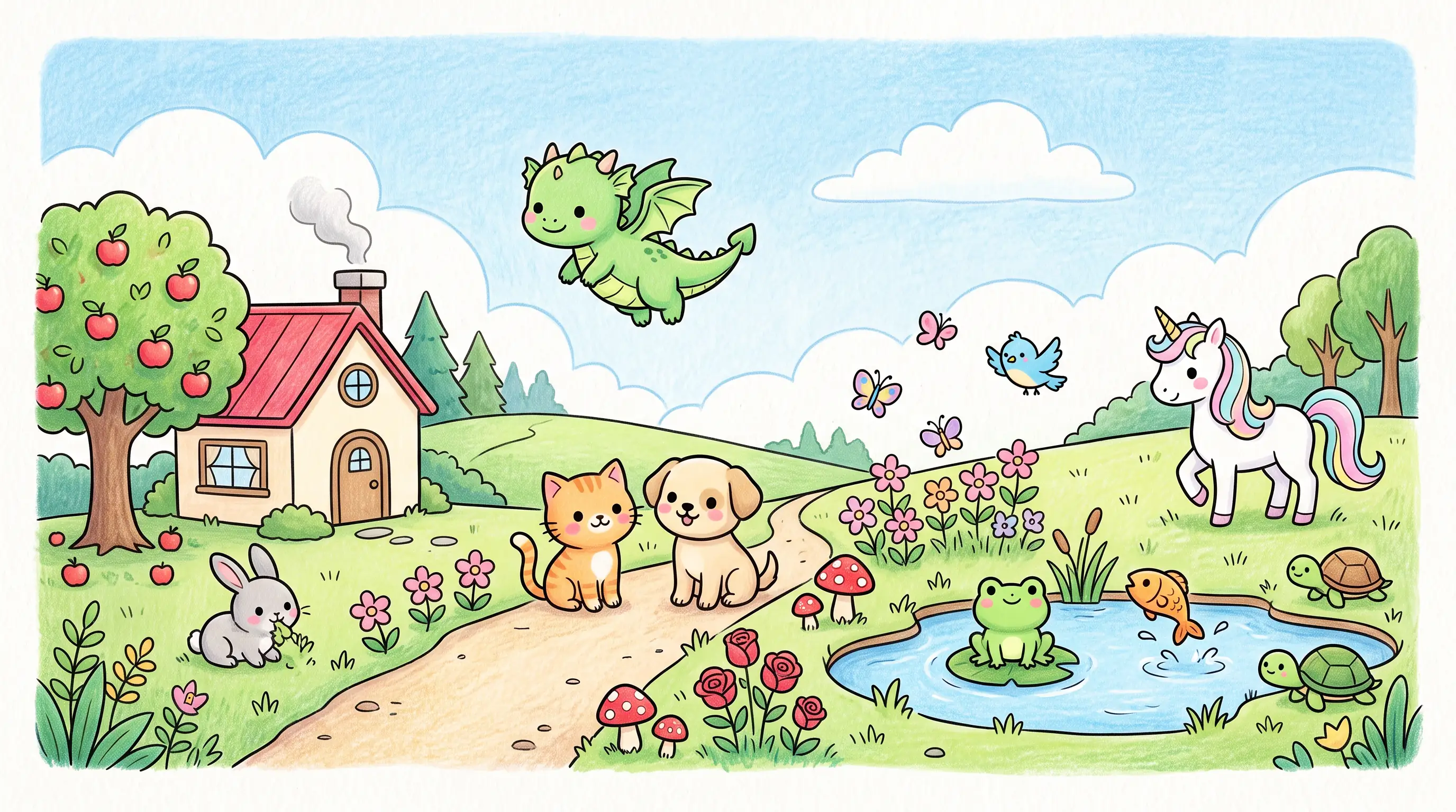
A color harmony, or color scheme, is a way of picking several colors on the color wheel so that they work well together. There are six main ones. Rather than showing them as swatches, here’s the same bouquet colored six times, starting from orange each time.
-
Complementary: orange and blue
Two colors facing each other: the strongest contrast, best used with one color clearly in the lead.
-
Analogous: orange, yellow-orange and red-orange
Three neighbors: a soft, natural look, like a sunset or a forest.
-
Triadic: orange, violet and green
Three evenly spaced colors: cheerful and balanced, perfect for a mandala.
-
Split complementary: orange, blue-violet and blue-green
Your color plus the two neighbors of its complement: contrast, with a softer touch.
-
Square: orange, red-violet, blue and yellow-green
Four evenly spaced colors: very rich, as long as one of them takes the lead.
-
Monochromatic
One hue, from light to dark: elegant and easy on the eye, great for learning shading.
Complementary colors
Two colors facing each other, like orange and blue. It’s the most contrasting harmony and the most lively one: perfect for a subject that needs to jump off the page. Let one color lead and keep the other for the details.
Analogous colors
Three neighboring colors, like yellow-orange, orange and red-orange. The result is soft and natural, because that’s what nature does: a sunset, a forest, a wheat field. It’s the easiest harmony to get right, and ideal for beginners.
Triadic colors
Three evenly spaced colors that form a triangle on the wheel, like orange, violet and green. The effect is cheerful and balanced, rich without being loud. For a mandala, it’s a safe bet: each ring can take one of the three colors.
Split complementary colors
Take a color, then the two neighbors of its complement instead of the complement itself: orange, with blue-violet and blue-green. You keep the contrast, with more flexibility and less risk of clashing.
Square (tetradic) colors
Four evenly spaced colors, one every three segments. It’s the richest harmony and the trickiest: choose one color to lead, and use the other three in smaller touches.
Monochromatic colors
A single hue, from very light to very dark. A monochromatic scheme looks elegant and is easy on the eye, and it’s the best exercise there is for learning light and shadow. Every shade of a color, with its codes, is in our color shades pages.
The 60-30-10 rule
It’s sometimes called “the 3 color rule.” It comes from interior design and works beautifully for coloring: one main color over about 60% of the page, a secondary color over 30%, and an accent color over 10%. With a complementary scheme, the complement often makes the accent; with a triad, each of the three colors takes one of those roles.
How to use a color wheel for coloring, in 4 steps
Here’s how to go from the color wheel to a finished page.
- Pick your main color. It’s the color of your subject, or of the mood you’re after: a blue for a seascape, a red for a Christmas scene. Find it on the wheel.
- Pick a harmony for the effect you want. Soft and natural: analogous colors. Bold, full of contrast: complementary or split complementary. Cheerful and balanced: a triad. Calm and refined: monochromatic.
- Share it out with the 60-30-10 rule. The main color on the large areas, the second on the medium ones, the third on the details you want to shine.
- Add the lights and darks. Each color in your harmony can get lighter in the light and darker in the shadow: that’s what gives volume. The shades of each color, and how to get them, are on pages like shades of blue, shades of green or shades of orange.
Three ideas to get started: a mandala in a triad (red, yellow, blue, one per ring), a landscape in analogous blues and greens with a little orange house as the complementary accent, and a stained glass coloring page in complementary colors for a glowing effect. To try your ideas on screen before picking up your pencils, our online coloring is made for it.
Common questions: clashing colors, black and white
Which two colors should not be used together? No pair is off limits. What “clashes” is almost always two bright opposite colors in equal amounts, right next to each other: bright red against bright green, for example. Three fixes: give one of them much more space, lighten or soften one of them, or separate them with white, black or a neutral color.
What color doesn’t go with blue? None, with the right balance. But a bright blue next to an equally bright violet can look heavy and flat: those two neighbors are too alike. Lighten one of them, or add a touch of orange to wake everything up.
What three colors go best together? Three colors in a triad, like red, yellow and blue, or three neighbors, like blue, blue-green and green. The first is bright and cheerful, the second soft and natural.
Which three colors cannot be made by mixing? The three primary colors: red, yellow and blue. That’s actually what makes them primary.
Do black and white go with everything? Yes. Since they have no hue, they don’t upset any harmony. Black gives strength to outlines and depth to shadows; white lets a page breathe and makes the colors around it shine.
Printable blank color wheel and harmonies sheet
The best color wheel is the one you color yourself, with your own pencils: it’s the only one that is exactly right for your supplies, since screen colors never quite match the ones in a box of pencils.
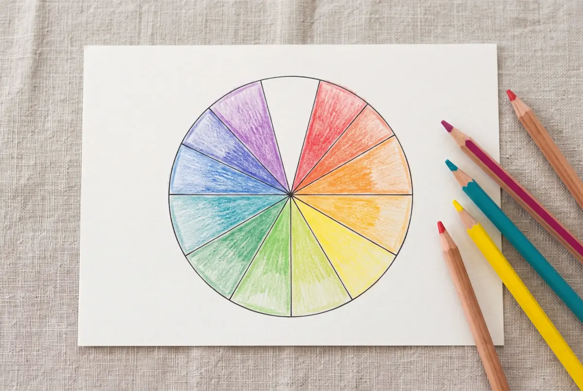
The sheet below has two pages:
- a blank color wheel to color in, with each segment named and marked (primary, secondary, tertiary), to fill in three steps: primaries, then secondaries, then tertiaries;
- a color harmonies sheet: the six harmonies on small color wheels, the six complementary pairs and three rules to remember.
Download the printable color wheel
A blank 12-segment color wheel to color in yourself, the 6 color harmonies and the complementary color pairs.
Once your wheel is done, keep it next to you while you color: just put a finger on it to find the complement or the neighbors of any color. It also makes a great art class worksheet, at home or at school. Then move on to a real drawing: our mandala coloring pages are perfect for trying one harmony per ring.
FAQ — The color wheel
8What is a color wheel?
How many colors are on the color wheel?
What are the primary colors?
What is the complementary color of green?
What is the opposite of orange on the color wheel?
Where is brown on the color wheel?
What are warm and cool colors?
Who invented the color wheel?
Key takeaways
- Neighbors on the wheel = harmony, opposites = contrast. Every color scheme follows from that rule.
- Complementary colors make each other glow side by side and cancel out when mixed: red and green, blue and orange, yellow and violet.
- Warm colors come forward, cool colors recede: an easy way to add depth to any landscape.
- One color leads, a second supports, a third adds the accent: the 60-30-10 rule.
To go further, our color mixing guide shows how to make every color on the wheel with your own pencils or paints, and our article on color gradients shows how to move smoothly from one color to the next. For ready-made combinations, our color palettes and our gradient generator are built on the same rules. All our color tools are gathered on the digital art tools page.
For the history of the color wheel and its many versions, Wikipedia’s “Color wheel” article is a good place to start.
Ready to try a harmony? The rings of a mandala are the perfect place for a triad or a monochromatic scheme
See the mandala coloring pages