
The printable sheet
One Letter page: the numbered chart with its codes, an empty row to recreate each shade, and a strip for your tests.
Free tool · color chart
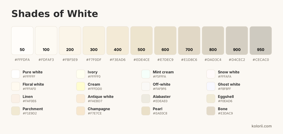
From pure white to bone, through ivory, cream and off-white, here are the different shades of white, each with its name and color code. Click a swatch to copy its HEX, RGB or CMYK code, or make your own shade with the sliders.
White 500
Closest named shade: Pearl #EAE0C8
#EDE4CE rgb(237, 228, 206) 0, 4, 13, 7 hsl(43, 46%, 87%) Make your own shade
The brightest whites, neutral or barely tinted: snow, ghost white, mint cream, ivory.
Whites softened with a touch of color: off-white, cream, linen, eggshell.
Warm, deeper whites leaning toward beige: champagne, parchment, alabaster, bone.
Every shade of white on this page with its HEX, RGB and CMYK codes, copied in one click.
| Shade | HEX | RGB | CMYK | |
|---|---|---|---|---|
| Pure white | #FFFFFF | rgb(255, 255, 255) | 0, 0, 0, 0 | |
| Ivory | #FFFFF0 | rgb(255, 255, 240) | 0, 0, 6, 0 | |
| Mint cream | #F5FFFA | rgb(245, 255, 250) | 4, 0, 2, 0 | |
| Snow white | #FFFAFA | rgb(255, 250, 250) | 0, 2, 2, 0 | |
| Floral white | #FFFAF0 | rgb(255, 250, 240) | 0, 2, 6, 0 | |
| Cream | #FFFDD0 | rgb(255, 253, 208) | 0, 1, 18, 0 | |
| Off-white | #FAF9F6 | rgb(250, 249, 246) | 0, 0, 2, 2 | |
| Ghost white | #F8F8FF | rgb(248, 248, 255) | 3, 3, 0, 0 | |
| Linen | #FAF0E6 | rgb(250, 240, 230) | 0, 4, 8, 2 | |
| Antique white | #FAEBD7 | rgb(250, 235, 215) | 0, 6, 14, 2 | |
| Alabaster | #EDEAE0 | rgb(237, 234, 224) | 0, 1, 5, 7 | |
| Eggshell | #F0EAD6 | rgb(240, 234, 214) | 0, 3, 11, 6 | |
| Parchment | #F1E9D2 | rgb(241, 233, 210) | 0, 3, 13, 5 | |
| Champagne | #F7E7CE | rgb(247, 231, 206) | 0, 6, 17, 3 | |
| Pearl | #EAE0C8 | rgb(234, 224, 200) | 0, 4, 15, 8 | |
| Bone | #E3DAC9 | rgb(227, 218, 201) | 0, 4, 11, 11 |
In paint, no mix makes white: you start from a white tube, or the white of the paper. On a screen, red, green and blue light add up to white. Every shade of white comes from a touch of color added to pure white.
white + a touch of ochre
A tiny touch of ochre, or of yellow and grey, is enough to soften pure white.
white + a touch of yellow
A white warmed with a touch of yellow; a hint of red makes it more golden.
white + a hint of yellow + a hint of gray
Subtler than cream: a hint of yellow and gray in plenty of white.
white + a hint of blue
A hint of blue gives a crisper, almost bluish white.
Depending on your supplies
With pencils, you don’t mix: you layer. Lay down the lightest shade in light strokes, then the darker one on top, without pressing. To lighten white, finish with a white pencil; to darken it, add a touch of grey or of its opposite color.
Water-based markers don’t blend well: pick the right shade straight away. With alcohol markers, go over a darker shade with a lighter one while it is still wet to soften the transition.
Mix on the palette, not on the paper. For a lighter shade, add water rather than white: the white of the paper does the lightening.
Acrylic or gouache: always add the dark color to the light one, a little at a time. Write down the amounts so you can find your shade again.
Four palettes taken from the chart, ready for a coloring page or a design. Click a color to copy its code.
A printable sheet to compare whites in daylight and pick the right one for your projects.
One Letter page: the numbered chart with its codes, an empty row to recreate each shade, and a strip for your tests.
Three shades from the chart on a real drawing: the lightest in the center, the darkest at the edge.
Want to do it by hand? Pick a drawing to print or color online.
Pure white is #FFFFFF, or rgb(255, 255, 255). Off-white is #FAF9F6, cream #FFFDD0 and ivory #FFFFF0.
Off-white (#FAF9F6) is barely softened; ivory (#FFFFF0) leans slightly yellow; cream (#FFFDD0) is yellower still.
Many: every touch of color added to pure white makes a new one. This page gathers 16 of them with their names and codes.
In light, white contains every color. In paint and drawing, it is a color in its own right, with warm and cool whites.
Sage green, navy blue and terracotta suit it well; black makes a softer contrast than with pure white.
