What you'll learn
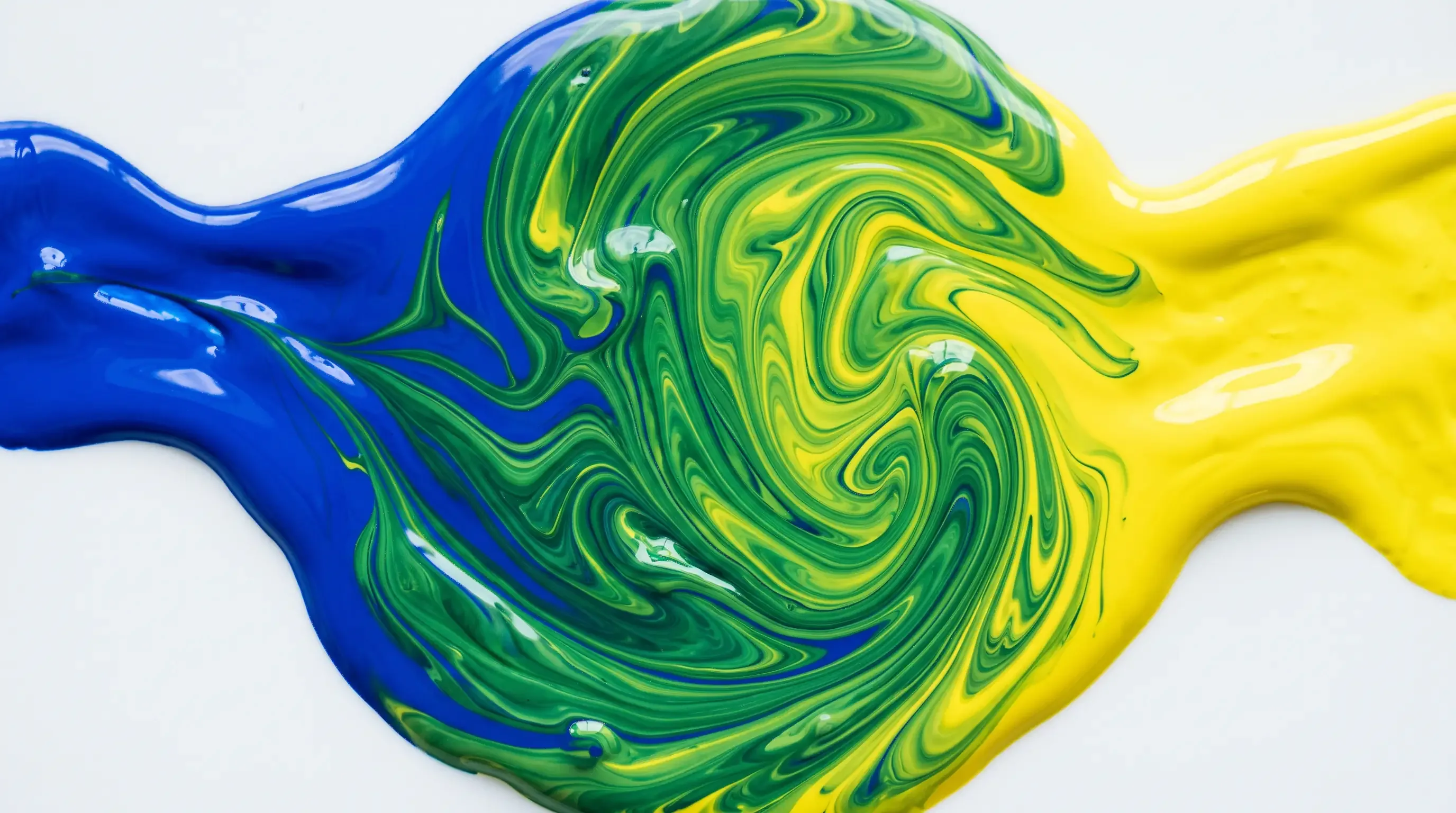
- A color mixer that behaves like real paint: blue and yellow really do make green
- A color mixing chart of 24 of the most searched mixes, with the result in color
- One rule to predict any mix: the mixing compass
- Easy ratios, thanks to strong colors and shy colors
- How to mix with every medium: colored pencils, markers, watercolor, paint, screen
- A printable color mixing chart and a practice grid
- The color mixer: try it first
- Why blue and yellow make green (but not on a screen)
- What colors make what? A 24-mix color mixing chart
- The mixing compass: the one rule to remember
- Ratios: strong colors and shy colors
- Lighten, darken or soften a color
- Mixing colors for coloring, one medium at a time
- Colors you can’t mix, and the tricky ones
- Why your mix turns muddy (and how to fix it)
- Printable color mixing chart and practice grid
- Key takeaways
Blue and yellow make green. So far, so good. But what about pink and green? Purple and orange? And why does a lovely red, mixed with a lovely green, turn into the color of a puddle?
Color mixing has a reputation as something only painters need to know. In fact, it follows a handful of simple rules, and they work for everything that puts color on paper: paint, of course, but also colored pencils, markers and watercolor. This guide gives you those rules without a theory lecture, starting from the only question that matters when you have two colors in front of you: what am I going to get?
Inside: a color mixer to try right now, a chart of 24 of the most searched mixes, one rule to work out all the others, easy ratios, the method for each medium and a chart to print.
The color mixer: try it first
Pick two colors, set how much of each, and watch the result. Unlike many online color mixers, this one doesn’t just average the two: it mimics the way pigments mix in a jar of paint. So blue and yellow give you a real green, not a gray.
Mix your colors
Pick two colors and how much of each: the result appears as if you were mixing them on a palette.
Your mix
#669D3A Closest color family: green
See all shades of greenThe mixing steps, from the first color to the second
The mix is worked out on your device; nothing is sent anywhere. Treat the result as a guide: your pencils and paints each have their own personality.
The palette has two reds and two blues, and that’s on purpose: try making purple with the bright red, then with the raspberry red, and you’ll see the difference right away. The slider sets the balance of each color in the result, not a volume of paint. And treat the result as a guide: your pencils, markers or tubes each have their own personality. Further down, you’ll see why, and how to use it.
Why blue and yellow make green (but not on a screen)
There are two ways to mix colors, and they give very different results.
With materials (paint, ink, pencil), every color works like a filter: it absorbs part of the light and reflects the rest. Yellow pigment mostly absorbs blue; blue pigment mostly absorbs red and yellow. Mix them, and between the two they hold back almost everything, except what neither absorbs: green. That’s why a paint mix is always darker than the two colors you started with, and why adding more and more colors eventually lands you on brown or black.
With light (a phone, computer or TV screen), it works the other way around: colors add up and the mix gets lighter. On a screen, red and green light make… yellow. That explains some of the puzzling answers you’ll find online, like “blue and green make yellow”: they’re talking about light, not paint.
This whole guide is about materials, the ones in your pencil case and on your palette. So is the mixer above.
What colors make what? A 24-mix color mixing chart
What color do blue and green make? What about red and green, pink and blue, or purple and yellow? Here are 24 color mixes, among the ones people search for most. Each row shows the two colors, the result and what you need to know to get it right. The “Try it” button opens the mix in the color mixer so you can tweak it; the link takes you to every shade of the resulting color.
Mixes that stay bright
These colors sit close together, so their mix keeps its glow.
| Mix | Result | Good to know |
|---|---|---|
| Blue + yellow | Green | More yellow for a fresh spring green, more blue for a deep pine green. All green shades |
| Red + yellow | Orange | Start with yellow and add red little by little: it takes over fast. All orange shades |
| Blue + red | Purple | A red that leans pink gives a clean purple; an orange-leaning red gives a dull, brownish one. All purple shades |
| Blue + green | Blue-green | Anywhere from turquoise to teal, depending on the balance. All teal shades |
| Yellow + green | Yellow-green | An apple green, or a lime green with plenty of yellow. Perfect for new leaves. All green shades |
| Blue + purple | Blue-violet | A deep indigo, the blue of a night sky. All blue shades |
| Orange + yellow | Yellow-orange | An amber or honey color, full of light. All yellow shades |
| Red + purple | Red-violet | A dark raspberry, somewhere between ruby and plum. All red shades |
Soft mixes with pink
Pink is red lightened with white. It softens everything it touches, so its mixes come out light and powdery.
| Mix | Result | Good to know |
|---|---|---|
| Pink + blue | Lavender | A cool, light purple. Add more blue and you drift toward periwinkle. All purple shades |
| Pink + purple | Mauve | A pinkish purple, close to orchid. All purple shades |
| Pink + yellow | Peach | A warm, pale orange, lovely for an early morning sky. All orange shades |
| Pink + orange | Coral | Somewhere between salmon and bright orange, depending on how much orange you add. All pink shades |
| Pink + red | Rosy red | A bright raspberry, softer than pure red. All red shades |
Mixes that fade out
These colors are far apart, or right across from each other, so they cancel each other out. You get a brown, a gray or a muted green. That’s not a failure: these are exactly the colors of earth, wood and fall leaves.
| Mix | Result | Good to know |
|---|---|---|
| Red + green | Brown | Two opposites: a brown that warms up with more red and darkens with more green. All brown shades |
| Blue + orange | Brown | A brown when orange wins; with white and more blue, a slate gray. All brown shades |
| Purple + yellow | Golden brown | A warm ocher brown; with more purple, it darkens toward plum. All brown shades |
| Orange + purple | Russet | A rusty, old-brick red-brown. All brown shades |
| Green + orange | Olive green | A very natural brownish green, halfway between moss and khaki. All green shades |
| Green + purple | Slate gray | A deep blue-green gray, gorgeous for shadows. All gray shades |
| Pink + green | Soft gray | Pink, which holds a lot of white, mutes the green: you get a soft, faintly bluish gray. All gray shades |
With white or black
White lightens and black darkens… but not always the way you’d expect.
| Mix | Result | Good to know |
|---|---|---|
| Red + white | Pink | The more white, the paler the pink. All pink shades |
| Black + white | Gray | With paint, add black to white, never the other way around: a tiny dab is enough. All gray shades |
| Red + black | Dark maroon | A very dark red-brown. For a livelier burgundy, darken red with a touch of blue instead. All red shades |
| Yellow + black | Olive green | The surprise of the chart: most blacks lean slightly blue, so yellow turns khaki instead of just getting darker. All green shades |
Looking for a color that isn’t here? Every way to mix each of our 13 colors, with all their shades and codes, is on our color shades pages.
The mixing compass: the one rule to remember
No need to learn the chart by heart. One rule lets you predict almost any mix: the farther apart two colors are, the more their mix fades.
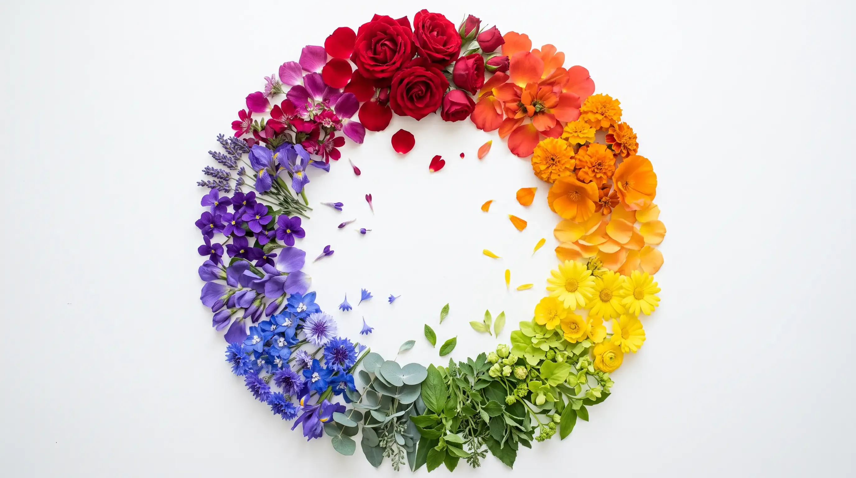
Arrange the colors in a circle, in rainbow order: yellow, orange, red, purple, blue, green, and back to yellow. Before you mix, just check where your two colors sit.
The mixing compass
- Neighbors: the mix stays bright (blue + purple)
- Two steps apart: the color in the middle (yellow + red)
- Face to face: they cancel out into brown (red + green)
- Neighbors (yellow and orange, blue and purple): the mix stays bright; it’s simply the color in between.
- Two steps apart (yellow and red, red and blue, blue and yellow): you get the color in the middle. It stays clean if your two colors lean toward each other, and turns dull if they don’t (that’s the hidden color, explained further down).
- Face to face (red and green, blue and orange, yellow and purple): they cancel out. The mix turns brown or gray.
This circle starts from three base colors, red, yellow and blue, which you can’t make from any others. Mixing primary colors two by two gives orange, purple or green; mixing all three gives a very dark brown, almost black. That’s all you need to know to mix colors: complementary colors, warm and cool colors and color harmonies are covered in our color wheel guide.
Pro tip
Want a really vivid green, orange or purple? Mix two colors that are neighbors of the one you want, rather than two colors farther away. An apple green comes out better from a lemon yellow and a blue-green than from a golden yellow and an ultramarine blue.
Ratios: strong colors and shy colors
Mixing “equal parts” rarely gives what you picture. The reason is simple: not all colors are equally strong. Some take over from the very first drop; others go along quietly.
- Strong colors: black, dark blue, red, purple. A tiny dab changes the whole mix.
- Shy colors: white, yellow, pale colors. You need a lot of them to make a difference.
Hence the tiny-dab rule: always start with the shy color and add the strong one in very small amounts. Do it the other way around and you’ll pour half a tube of yellow trying to fix a single drop of blue.
A few starting ratios, by volume of paint, to adjust by eye:
| To get | Start with | Gradually add | Rough ratio |
|---|---|---|---|
| A clean green | Yellow | Blue | about 3 parts yellow to 1 part blue |
| A bright orange | Yellow | Red | about 2 parts yellow to 1 part red |
| A balanced purple | Red (pink-leaning) | Blue | about 1 to 1, adjusted to your paints |
| A light gray | White | Black | about 10 parts white to 1 part black |
| A pale pink | White | Red | about 8 parts white to 1 part red |
These ratios are only a starting point: every brand loads its pigments differently, and a very strong blue needs even less. In the mixer, the slider doesn’t count drops; it sets the visual balance of the result, which is the fastest way to see where you’re headed before you pick up a brush.
Lighten, darken or soften a color
Once you’ve found the right color, you’ll often want a lighter, darker or softer version of it. There are three ways to change it, and each has its trap.
Lighten (tints). With opaque paint, add white: the color gets lighter, but also paler and cooler. With watercolor, add water: the white of the paper does the rest, and the color stays transparent. With colored pencils, press lighter, or go over it with a white pencil.
Darken (shades). The reflex is to add black. It works with blue and red, much less with yellow, which turns olive (see the chart). The nicest way to darken a color is to add its darker neighbor: a little red in orange, a little blue in green, a little purple in blue. The color stays alive.
Soften (tones). To calm a color that’s too loud without darkening it, add a hint of its opposite: a touch of red in green, orange in blue, purple in yellow. A neon green becomes sage, an electric blue becomes blue-gray. That’s the compass at work: a little of the color across the circle mutes it just enough.
Mixing colors for coloring, one medium at a time
The rules are the same for every medium; only the way you mix changes. With paint, you mix before the color touches the paper. With colored pencils and markers, you mix on the paper, by layering.
Colored pencils: light layers on top of each other
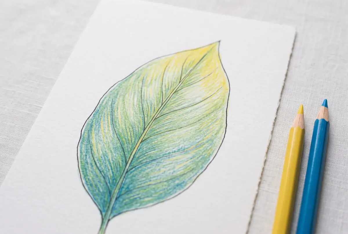
With colored pencils, there’s no mixing well: you lay down one color, then another on top, and your eye blends them.
- Start with the lightest color, pressing very lightly.
- Add the second color on top, still lightly, in small circles or tight strokes.
- Repeat if needed: three or four light layers give a richer mix than one heavy one.
- If you like, finish with a white or colorless pencil pressed firmly: it flattens the paper’s tooth and fuses the layers.
The top layer counts a little more than the others: yellow over blue gives a warmer green than blue over yellow. And just like paint, layering opposite colors mutes the result, which is great for graying down foliage and best avoided in a sky. The big shapes of a mandala make a great test area.
Markers: layering at the right moment
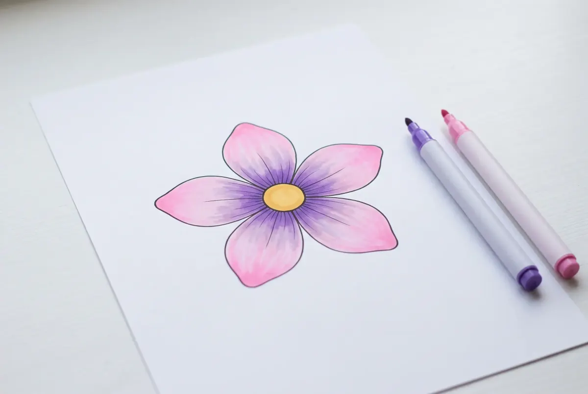
Let’s be honest: mixing with markers takes more finesse.
- Water-based markers (school markers) can be layered once the first coat is completely dry. Going over wet ink damages the paper and leaves streaks.
- Alcohol markers, on the other hand, blend while the ink is still wet: lay down the light color, add the dark one, then go over the edge with the light one to marry them.
- Either way, go from light to dark: a light marker over a dark color muddies it fast… and stains its own tip, too.
Watercolor: three ways to mix
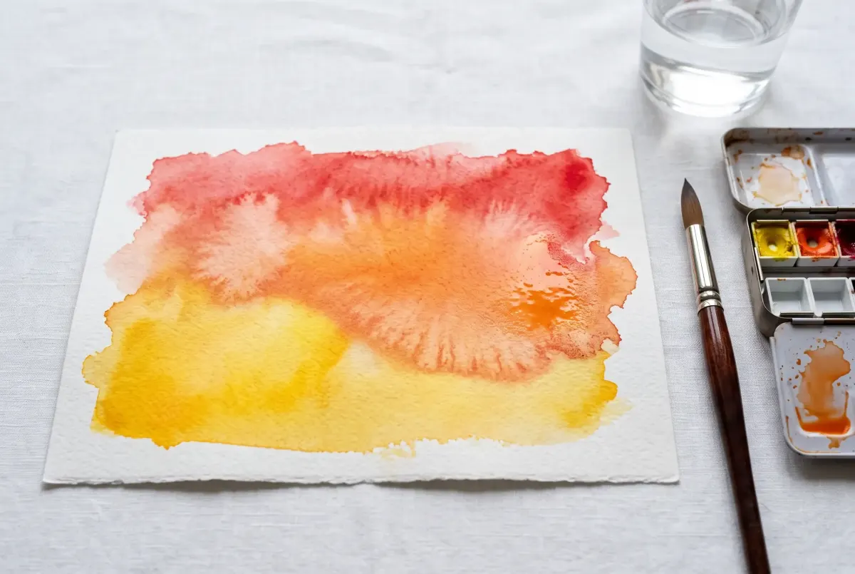
Watercolor gives you more ways to mix than any other medium:
- On the palette, like any paint: you prepare the color before you lay it down. It’s the most predictable method.
- By glazing: you lay down one color, let it dry completely, then brush a second transparent color over it. Yellow under blue gives a glowing green with a purity that’s hard to get any other way.
- Wet-in-wet: you drop two colors side by side on damp paper and let them meet on their own. The mix is unpredictable and often stunning, perfect for the sky of a landscape.
Rinse your brush often: with watercolor, a leftover trace of an old color is enough to dull the next mix.
Gouache and acrylic: on the palette
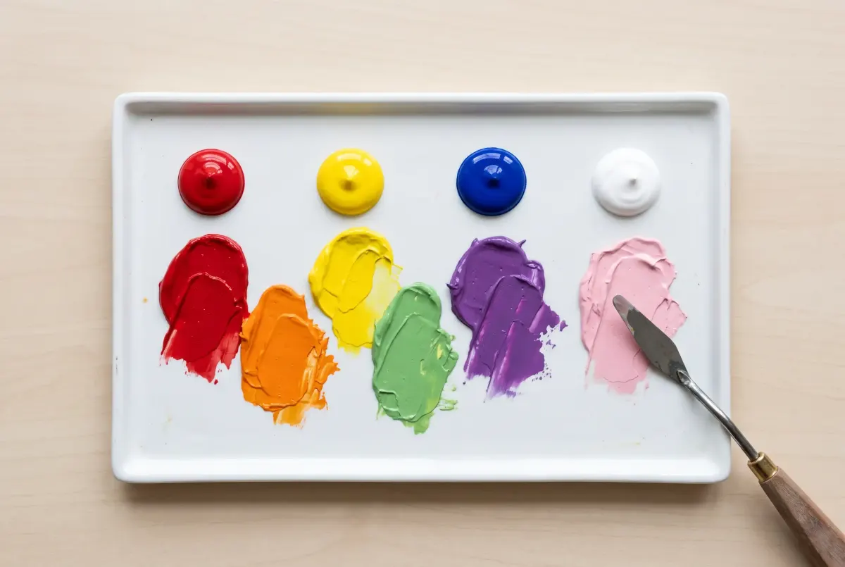
- Mix on the palette, and make enough for the whole area: matching the exact same color a second time is almost impossible.
- Mix with the brush or, better, with a small palette knife, until you can’t see any streaks of either color.
- Watch out for drying: gouache often shifts a little in value as it dries, and acrylic darkens slightly. Test on a corner of paper and let it dry before you commit.
On screen: the mixer, then the code
In digital art, you don’t really mix: you pick the resulting color directly. The easiest way is to find your mix in the mixer above, copy its code, and use it in your drawing app. To move smoothly from one color to another, our gradient generator works out every in-between shade, and our color palettes offer ready-made combinations. To color right on your screen, try our online coloring pages.
Colors you can’t mix, and the tricky ones
The ones no mix can make
- White: no paint mix gets lighter, so you need real white (or the white of the paper, with watercolor).
- The red, yellow and blue you start from: the three base colors can’t be made from others. You can get close (magenta and yellow make a red), but never as pure.
- Neon and metallic colors: their glow comes from special pigments that no mix can copy.
The ones that need a trick
Gold. A mix can’t shine, so all you can get is a gold color, a warm ocher yellow: add a touch of red and a hint of brown to yellow. The metallic look then comes from contrast: leave a small, very light area, almost white, next to a darker one, like a reflection.
Skin tones. There’s no single “skin color”, but endless skin tones. They all start from the same trio: a little red, a little yellow and a touch of blue or brown to adjust. More white and yellow for light skin, more brown and red for medium skin, deep brown with a hint of blue for dark skin. Always look at your model: the exact color comes together by eye, one small touch at a time.
A rich black. Black from the tube often looks flat. Mix a very dark blue with a very dark brown instead, or all three base colors: you get a deep black you can warm up or cool down at will. See all its shades on our shades of black page.
Colorful grays. A gray made from black and white is neutral, sometimes dull. A gray made from two opposites (blue and orange, then white) has more life: it leans slightly one way or the other and makes much more natural shadows.
Why your mix turns muddy (and how to fix it)
It’s the classic: you wanted a vivid green, you got a sad khaki. The causes are almost always the same.
- Too many colors in one mix. Past three, colors almost always cancel each other out. Keep your mixes to two colors, three at most.
- A hidden color inside your color. This is the least known cause. No tube or pencil is perfectly pure: every color leans slightly toward a neighbor. A red can lean orange or pink; a blue can lean green or purple. Mix an orange-leaning red with a green-leaning blue to make purple, and you’re secretly mixing all three base colors: the purple turns brown. The fix: choose colors that lean toward each other, a pink-leaning red and a purple-leaning blue. The mixer above lets you see it for yourself.
- A dirty brush or water jar. A trace of the previous color is enough to dull the next. Keep two jars of water: one to rinse, one to wet.
- Too much of the opposite color. A dab of orange softens a blue; a spoonful turns it brown. Always add in small amounts.
- Black to darken. It dulls as much as it darkens. Use the darker neighbor instead (see above).
- Too many wet layers. With watercolor and markers alike, going over a wet area again and again mixes everything in it. Let it dry, then come back.
What if it goes wrong?
A mix that turned brown is never wasted: save it for shadows, tree trunks or a fall landscape background. Those are often the most beautiful colors in a drawing.
Printable color mixing chart and practice grid
The best way to know your colors is to mix them yourself. The PDF below has two pages:
- the 24-mix color mixing chart in color, to keep next to your drawing table;
- a practice grid: your colors across the top and down the side, and in each square, the mix of the two, made with your pencils, markers or paints. It’s the only color mixing chart that’s exactly right for your supplies, because you make it yourself.
Download the color mixing chart
The 24-mix chart in color, a practice grid to test your own supplies and the 4 rules to remember.
Then try it on a real drawing: the petals and leaves of our flower coloring pages are perfect for mixing pinks, purples and greens. All our free coloring pages print in one click.
FAQ — Color mixing
8What colors make what?
What colors can't be made by mixing?
Why do red and green make yellow on a screen?
What color do you get when you mix all colors?
How many colors do you need to mix any color?
Can you mix colored pencils?
How do you lighten a color without white?
Why does my color mix turn brown?
Key takeaways
- Blue + yellow = green, red + yellow = orange, red + blue = purple: everything else can be worked out with the compass.
- Neighbors = bright mix, opposites = brown or gray. To tone down a color that’s too loud, a hint of its opposite is enough.
- Start with the shy color and add the strong one in tiny amounts.
- Two colors, three at most: beyond that, your mix turns to mud.
To go further, each of our 13 color shades pages shows every way to mix that color, and our guide to color gradients shows you how to move smoothly from one color to the next. All our tools for working with color are gathered on our digital art tools page.
To understand why materials and light mix so differently, Wikipedia’s article on “Subtractive color” is a good place to start.
Want to put your mixes to work? The petals and leaves of our flower pages are perfect for it
See the flower coloring pages