
The printable sheet
One Letter page: the numbered chart with its codes, an empty row to recreate each shade, and a strip for your tests.
Free tool · color chart
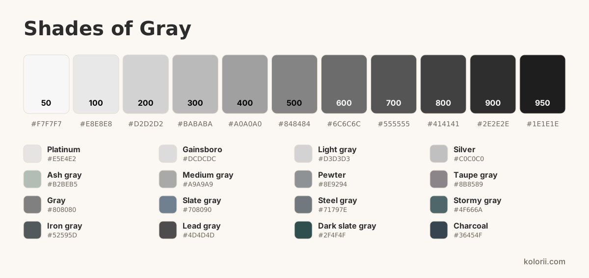
From platinum to charcoal, here are the different shades of gray (or grey, the British spelling), each with its name and code: some lean blue, green or brown. Click a swatch to copy its HEX, RGB or CMYK code, or make your own shade of gray with the sliders.
Gray 500
Closest named shade: Gray #808080
#848484 rgb(132, 132, 132) 0, 0, 0, 48 hsl(0, 0%, 52%) Make your own shade
Bright, almost-white grays: platinum, gainsboro, silver and ash gray.
Everyday grays, neutral or tinted: pewter, taupe gray, slate gray and steel gray.
Deep grays, from iron gray to charcoal, close to black.
Every shade of gray on this page with its HEX, RGB and CMYK codes, copied in one click.
| Shade | HEX | RGB | CMYK | |
|---|---|---|---|---|
| Platinum | #E5E4E2 | rgb(229, 228, 226) | 0, 0, 1, 10 | |
| Gainsboro | #DCDCDC | rgb(220, 220, 220) | 0, 0, 0, 14 | |
| Light gray | #D3D3D3 | rgb(211, 211, 211) | 0, 0, 0, 17 | |
| Silver | #C0C0C0 | rgb(192, 192, 192) | 0, 0, 0, 25 | |
| Ash gray | #B2BEB5 | rgb(178, 190, 181) | 6, 0, 5, 25 | |
| Medium gray | #A9A9A9 | rgb(169, 169, 169) | 0, 0, 0, 34 | |
| Pewter | #8E9294 | rgb(142, 146, 148) | 4, 1, 0, 42 | |
| Taupe gray | #8B8589 | rgb(139, 133, 137) | 0, 4, 1, 45 | |
| Gray | #808080 | rgb(128, 128, 128) | 0, 0, 0, 50 | |
| Slate gray | #708090 | rgb(112, 128, 144) | 22, 11, 0, 44 | |
| Steel gray | #71797E | rgb(113, 121, 126) | 10, 4, 0, 51 | |
| Stormy gray | #4F666A | rgb(79, 102, 106) | 25, 4, 0, 58 | |
| Iron gray | #52595D | rgb(82, 89, 93) | 12, 4, 0, 64 | |
| Lead gray | #4D4D4D | rgb(77, 77, 77) | 0, 0, 0, 70 | |
| Dark slate gray | #2F4F4F | rgb(47, 79, 79) | 41, 0, 0, 69 | |
| Charcoal | #36454F | rgb(54, 69, 79) | 32, 13, 0, 69 |
The simplest gray is black mixed with white. For a livelier gray, mix two opposite colors such as blue and orange, then lighten with white. A touch of color then warms it up or cools it down.
black + white
Add the black to the white, a little at a time: a touch of black greys a lot of white.
blue + orange + white
Two opposite colors, lightened with white, make a livelier gray than black and white.
gray + a touch of brown
A touch of brown, or red, warms the gray up toward taupe.
gray + a touch of blue
A touch of blue cools the gray into slate gray.
Depending on your supplies
With pencils, you don’t mix: you layer. Lay down the lightest shade in light strokes, then the darker one on top, without pressing. To lighten gray, finish with a white pencil; to darken it, add a touch of grey or of its opposite color.
Water-based markers don’t blend well: pick the right shade straight away. With alcohol markers, go over a darker shade with a lighter one while it is still wet to soften the transition.
Mix on the palette, not on the paper. For a lighter shade, add water rather than white: the white of the paper does the lightening.
Acrylic or gouache: always add the dark color to the light one, a little at a time. Write down the amounts so you can find your shade again.
Four palettes taken from the chart, ready for a coloring page or a design. Click a color to copy its code.
A printable sheet to practice with: recreate each shade of gray with colored pencils or paint, box by box.
One Letter page: the numbered chart with its codes, an empty row to recreate each shade, and a strip for your tests.
Three shades from the chart on a real drawing: the lightest in the center, the darkest at the edge.
Want to do it by hand? Pick a drawing to print or color online.
Both are correct: gray is the American spelling, grey the British one. They name the same color.
On a screen there are 254 neutral grays between white and black, and many more tinted ones. This page gathers the 16 best-known grays with their names.
The reference medium gray is #808080, or rgb(128, 128, 128). A neutral gray always has three equal RGB values.
Charcoal (#36454F) is a very dark, almost black gray; slate gray (#708090) is lighter and leans blue.
Mustard yellow for a bright touch, dusty pink for softness, teal for a deep look. Our grey gradients show ready-to-download examples.
